Queen, Ingredients For Creativity
Siraprapa Charassrivisist
siraprapa.com, siraprapaa.c@gmail.com
“Queen, Ingredients for Creativity” is a rebranding project for a 60-year old family company producing ingredients for bakeries and cafes across Thailand. The term “Brand Communication” is commonly recognised in the consumer market but often neglected in the business market. The business market is believed to be motivated only by product quality and value. This belief raises the question of whether or not communication design is important for brands in the business market.
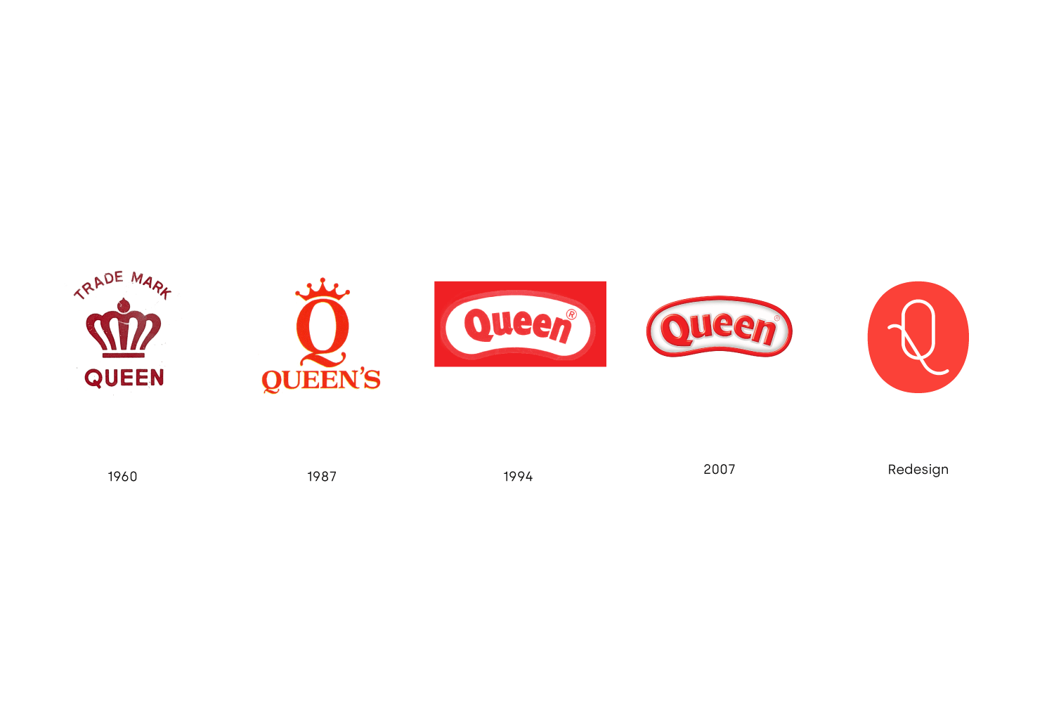
‘Queen, Ingredients for Creativity’ is a brand identity project exploring the importance of communication design in the business market. Established in 1960, Queen was a well-known brand in the Thai market. Despite its popularity in the past, its reputation has declined along the way. The cause of the declining trend appears to be the lack of good communication design in Queen’s branding. After research, the brand design appeared to be the first gate bridging the brand and the customers since they are relevant to customers’ prejudgement about the products.
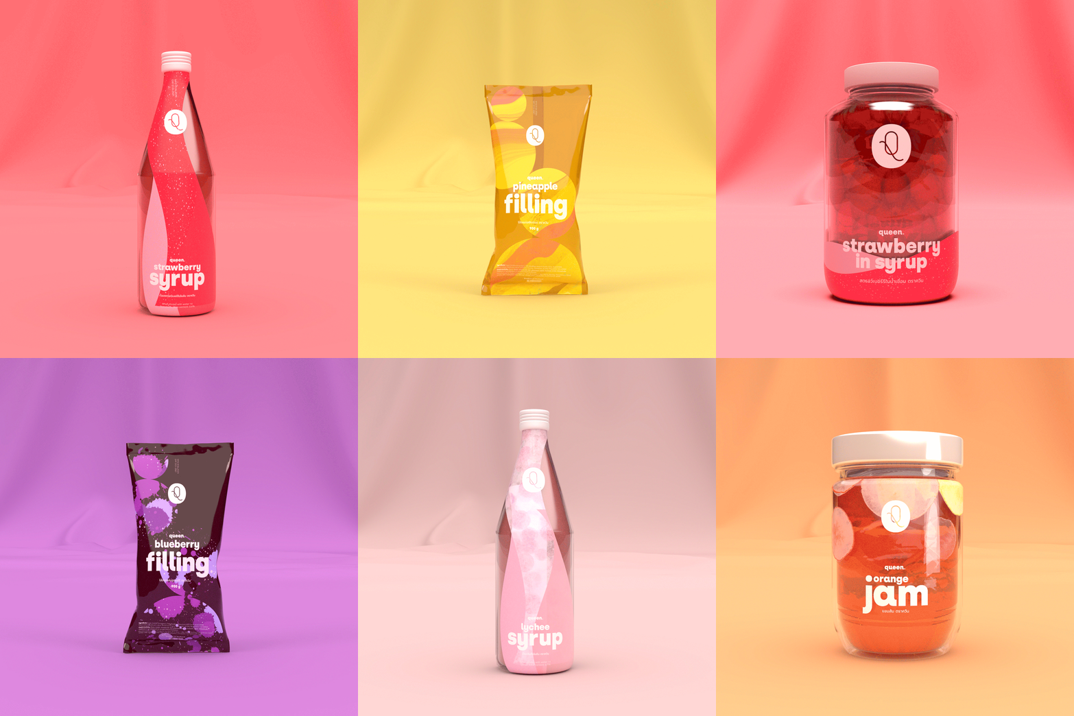
Under the brand’s big idea of “Ingredients for Creativity”, the project explores the ability of communication design as the bridge between Queen and its customers while maintaining the cost of production. Enhancing designs is not a financial burden for brands in the business market, but serves as a support system to provide stability and longevity. The project includes logo and wordmark design, pattern design, custom type solution, packaging design, business card design, and a short advertisement.
Logo & Wordmark
Business Card Design — Our logo is our business card. Unique business card design makes Queen stand out from competitors.
Type System — The type system is designed to simplify the complexity of product variations. The type hierarchy differentiates product categories, while maintaining unity with type arrangement and custom typeface.
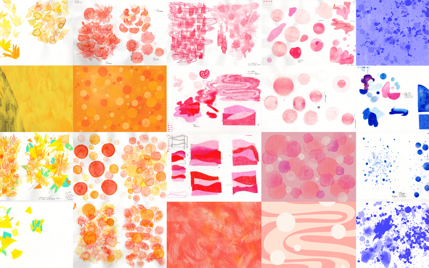
5 Flavours, 5 Patterns — The pattern is used to signify and express ‘product flavours’. The patterns are designed to cooperate with product colour inside the packaging to emphasise the big idea of ‘Ingredients for Creativity’.
The White Cap Brand — The white cap unifies products across categories while reducing the cost of production since the cap can be applied to every flavour.
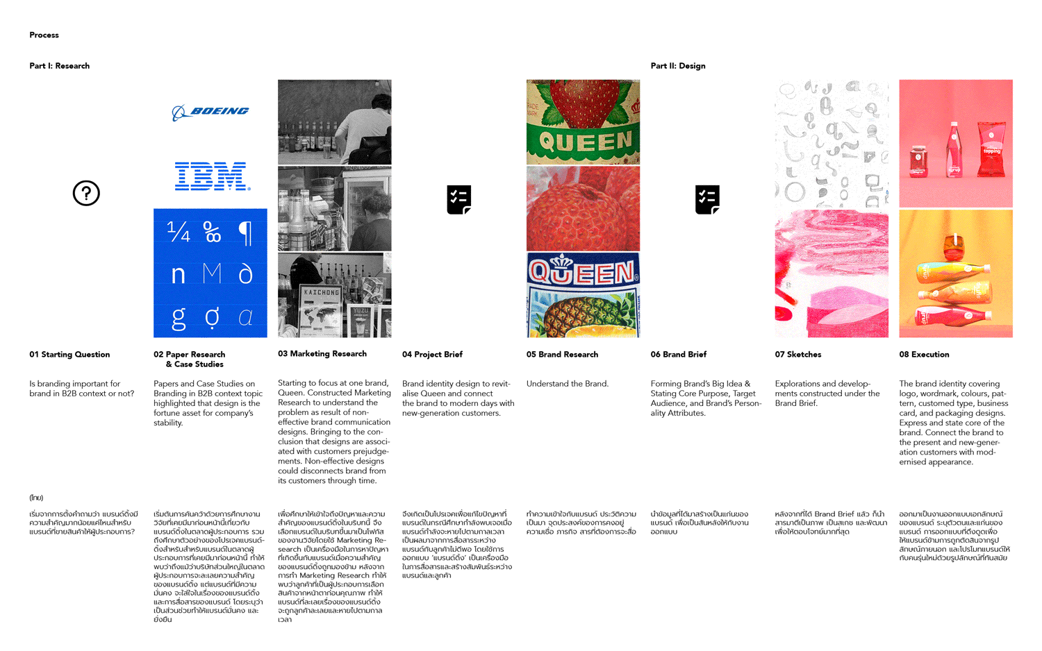
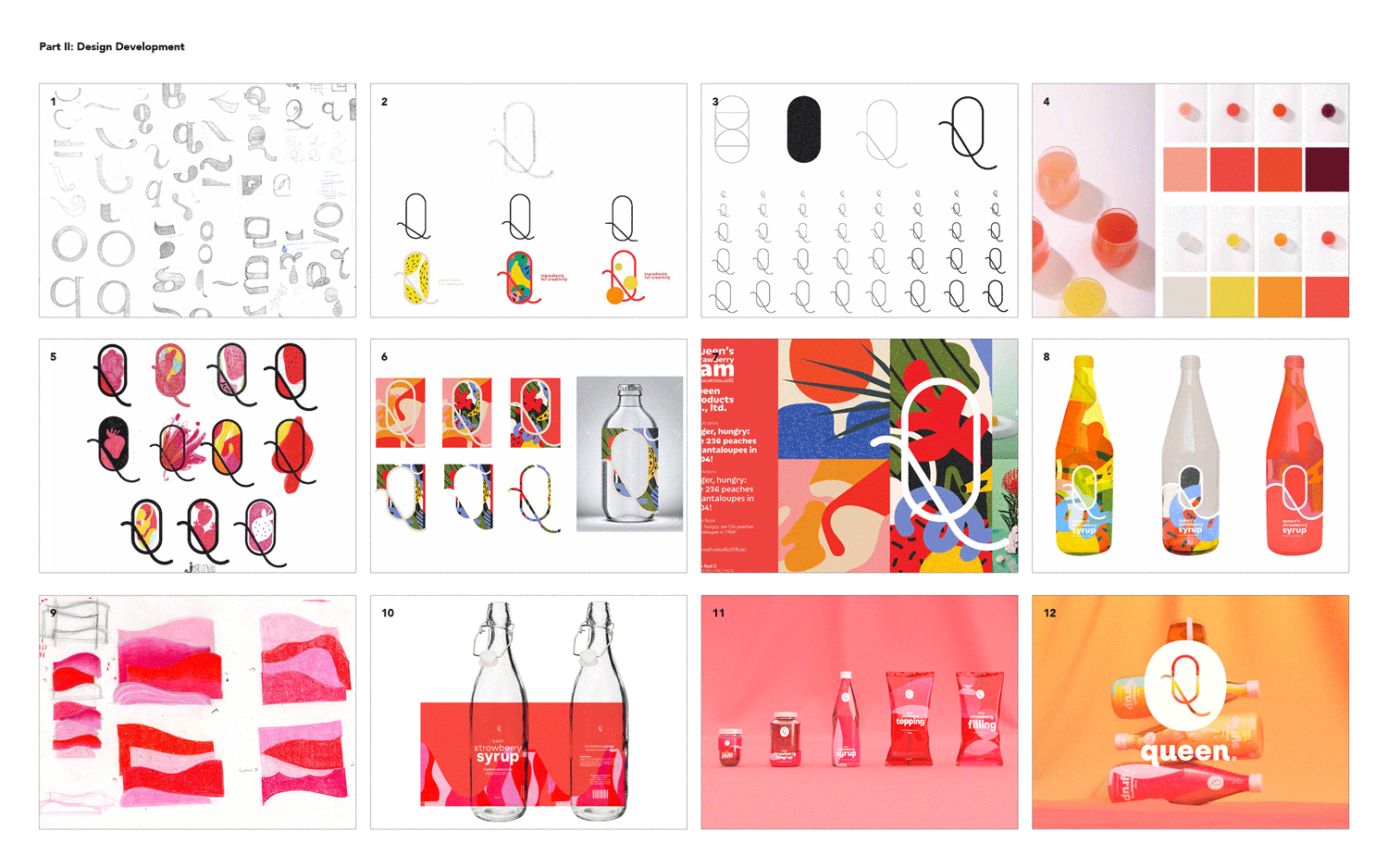
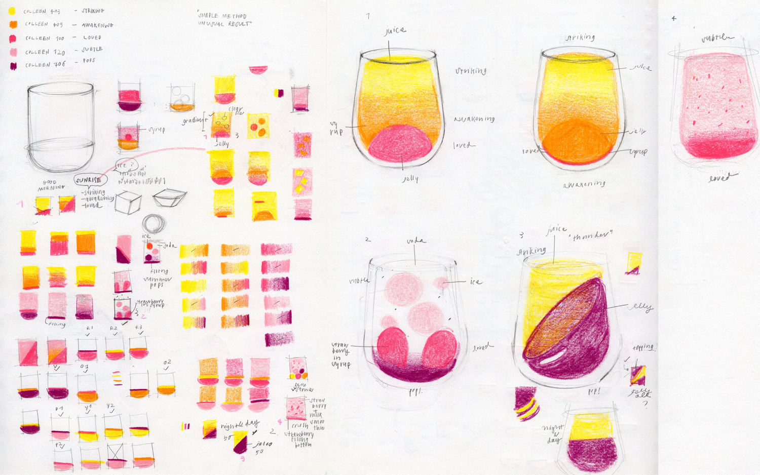
Work Process
